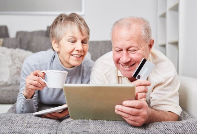
Augmentez les conversions grâce à votre page d'accueil !
Mardi 23 janvier 2024
La page d'accueil est généralement la porte d'entrée de votre site de e-commerce. A quelques exceptions près, où le visiteur arrive sur une page Blog ou une page produit, c'est la page d'accueil, d'où son nom, qui accueille les visiteurs.
Il est dès lors essentiel qu'elle soit nickel, parfaite, chouchoutée, mise à jour, de bonne qualité, bref, qu'elle donne envie au visiteur d'entrer et de découvrir votre univers.
Pas toujours facile de savoir comment composer sa page d'accueil. Laissez-vous guider, nous vous donnons dans cet article les trucs et astuces à implémenter pour améliorer votre page d'accueil, séduire le visiteur et au final, augmenter vos ventes !
1. La ligne de flottaison
Tout d'abord, il est important de comprendre le concept de la ligne de flottaison. La 'ligne de flottaison' fait référence à la partie visible d'une page web sans avoir besoin de faire défiler vers le bas.
Cette partie est cruciale car elle influence grandement les décisions d'achat des visiteurs. En effet, le but est de motiver le visiteur à faire défiler votre page, à cliquer sur les boutons d'appel à l'action et de plonger dans votre univers pour trouver rapidement ce qu'il cherche.
2. Le logo
Il est important que votre logo soit reconnaissable et clair. Le logo doit également être cliquable de manière à rediriger le visiteur vers la page d'accueil lorsqu'il se promène dans le site. Cette astuce va permettre une meilleure navigation, ce qui va aider à augmenter la conversion de votre boutique en ligne.
3. Le Menu de navigation
Certains sites de e-commerce choisissent de travailler avec plusieurs menus : Le menu principal, un menu secondaire et un menu de bas de page. Le tout est d'avoir un menu principal qui permet au visiteur d'avoir une vue d'ensemble de ce qu'il peut trouver sur votre site.
Le menu de navigation principal doit être clair avec des catégories de produits pour faciliter la recherche. Il peut aussi inclure les pages annexes et les différentes sections, telles que « BLOG », « CONTACT », « A PROPOS », « PROMOS ».
4. Description de l'offre
Dans le texte d'accroche de votre boutique en ligne, le visiteur doit directement savoir ce que vous vendez et ce qu'il va trouver sur votre site. Il est donc essentiel de prendre le temp de rédiger et de bien définir la description de l'offre que vous proposez.
On parle de ‘proposition de valeur ajoutée' (ou ‘added value proposition'). Une proposition de valeur est une phrase SIMPLE, unique, claire et courte, qui résume les raisons pour lesquelles un client choisirait votre produit.
La proposition de valeur se construit autour de trois axes :
- l'offre elle-même et ses attributs
- le consommateur et les bénéfices qu'il en attend
- la différenciation des offres concurrentes.
Cette proposition de valeur doit être la première chose que le visiteur lit en arrivant sur votre e-shop. Elle est généralement illustrée par un visuel attrayant de bonne qualité, comme une photo life-style ou une image produit de haute résolution en rapport avec votre marque pour attirer l'attention.
5. CALL to ACTION
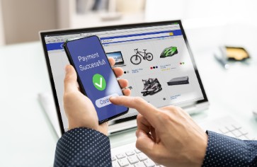
Le bouton ‘call-to action' doit être clair et incitatif. Soit vous proposez au visiteur d'entrer dans votre univers via un bouton « E-SHOP », ou « PROMOTIONS », soit vous affichez les best sellers sur votre page d'accueil et vous ajoutez bien sur les boutons « Ajouter au Panier ». De manière générale, c'est à vous de guider le visiteur vers ce qu'il cherche, via le chemin le plus court possible.
6. Frais de livraison & délai
Une des premières choses que votre visiteur veut savoir en arrivant sur votre site, ce sont les frais de livraison (si livraison offerte à partir d'un certain montant) ainsi que les délais. Le consommateur est en effet de plus en plus pressé et son achat va dépendre, en partie du délai de réception de sa commande. De plus, s'il voit que la livraison est offerte à partir d'un certain montant, cela va le motiver à remplir son panier en conséquence, et votre panier moyen sera donc augmenté.
Si vous ne pouvez pas assurer des délais courts, n'hésitez pas à mentionner les délais réels. Le tout est de communiquer clairement. Si le visiteur sait à l'avance qu'il va devoir attendre une semaine, car il s'agit d'une confection personnalisée ou d'un ré-assort, il s'organise en fonction. La communication avec le client et « l'expérience client » reste votre atout #1 pour vous démarquer de la concurrence.
7. Contact
Le visiteur qui a une question concernant son panier ou sa commande souhaite recevoir une réponse rapide. Pour augmenter la conversion de votre boutique en ligne, il est donc essentiel d'afficher au moins un numéro de téléphone. Facile et rapide, le numéro de téléphone a pour but de montrer au client que vous êtes tout à fait disponible et disposé à répondre à ses questions et à le guider dans son parcours d'achat. Le contact téléphonique implique indirectement une proximité et donc un lien avec votre visiteur, ce qui va également augmenter la confiance du visiteur envers votre boutique en ligne. Si vous ne souhaitez pas afficher de numéro de téléphone, vous pouvez afficher une adresse mai, un numéro wazap Business, un chat direct, le tout est de proposer un support rapide.
8. Barre de recherche
Une barre de recherche visible aide les utilisateurs à trouver rapidement les produits qu'ils recherchent. La barre de recherche a plus de sens si vous proposez un assortiment large de produits et de marques différents, que si vous avez une boutique en ligne qui propose une marque niche d'un produit précis.
9. Promotions & Offres spéciales
Lorsque vous proposez des promotions, des soldes ou des offres spéciales, mettez-les en avant. Que ce soit via le visuel principal, via votre menu de navigation, via une bannière ou un bouton ‘call-to-action', cela va encourager les achats.
En mettant toutes ces informations à disposition du visiteur avant même qu'il ait besoin d'aller plus loin, il aura les réponses à ses questions, il sera rassuré quant au professionnalisme de site qu'il visite et sera en confiance pour entrer dans l'univers de votre marque.
Voici les informations complémentaires qu'il est nécessaire d'ajouter à la page d'accueil de son e-shop, quitte à devoir faire défiler la page pour y arriver. Ces informations auront pour but de rendre votre page complète et détaillée pour le visiteur qui souhaite prendre le temp de découvrir votre univers.
10. Les Best Sellers
En affichant les produits phares et les meilleures ventes, vous orientez déjà le visiteur vers ce qu'il cherche potentiellement. Vous attirez l'attention du visiteur en sachant qu'il sera plus que probablement attiré par ces produits ‘mis en avant' qui ont déjà séduit les clients précédents.
11. Avis clients & témoignages
Voilà ce qu'on appelle ‘la preuve sociale' : La preuve sociale est un concept psychologique selon lequel les choix des uns influent sur les choix des autres. En affichant sur votre e-shop les avis et commentaires positifs reçus de vos clients, le visiteur va être en confiance et va vouloir, lui aussi, faire partie de ces clients satisfaits. Le visiteur est enclin à acheter un produit déjà acheté par d'autres, car il est rassuré.
Les avis clients peuvent être affichés par des étoiles de notation, des critiques ou des témoignages de clients, le tout pour renforcer la confiance du visiteur envers votre marque et sa crédibilité.
12. Éléments de sécurité & de confiance
Un autre élément de confiance pour rassurer le visiteur est d'afficher les badges de sécurité, pour la sécurité de leurs transactions. Il est également intéressant d'affiche les badges qui prouvent la certification à certaines normes, telles que « BIO », « ARTISAN CERTIFIE » etc
13. Liens vers les réseaux sociaux
A l'heure actuelle, il est indispensable de faire la promotion de votre boutique en ligne sur les réseaux sociaux. N'hésitez pas à mettre le lien et les icones de vos réseaux sur votre page d'accueil afin d' et la encourager la connectivité. Les visiteurs apprécient de pouvoir plonger dans votre univers, découvrir les nouveautés et l'évolution de votre marque ‘au jour le jour' sur les réseaux. Inversement, vérifiez que vos réseaux sociaux redirigent bien vers votre boutique en ligne.
L'objectif de la page d'accueil est de créer une première impression positive, une expérience utilisateur positive dès leur arrivée sur la page. Ceci afin de donner aux visiteurs une idée claire de ce que propose votre boutique en ligne et de les encourager à explorer davantage. De cette manière, vous encouragez les visiteurs à explorer davantage, vous augmentez la conversion des visiteurs sur votre site et donc vos ventes!
Retour